Product Design
Oasis Design System Cut Design Time by 73% and Enabled a 3.75x Faster Product Revamp
Company
Safe Security
Product Design
Oasis Design System Cut Design Time by 73% and Enabled a 3.75x Faster Product Revamp
Company
Safe Security

When I joined Safe Security, a cybersecurity and risk management platform, the design ecosystem was highly fragmented.
There was no defined design system—no structured color palette, no component library, and no unified design language between design and development teams.
The UI was outdated and lacked support for both light and dark modes, creating inconsistencies in the overall experience.
Without a shared design system, collaboration between designers and developers became inefficient, leading to delays and misalignment.
A critical decision came from the CEO, A complete product revamp, the introduction of 15+ new features, and a mobile app launch, all within 2-3 months. To make things more intense, we were only two designers responsible for managing all of this.
This felt like a “chicken-and-egg” problem:
Do we focus on feature work with the old UI? Or prioritize building a new UI, knowing the features would eventually need to be redesigned?
After evaluating the situation, it became clear that without a structured design system, the revamp would be unmanageable.
This led to the decision to focus on establishing a robust design system to streamline the entire process and ensure long-term scalability

I designed a tailored process for Oasis that aligned with the real-world complexity of our product, rather than relying on a one-size-fits-all model. It began with a deep audit to uncover inconsistencies and prioritize high-impact components.
Parallelly, we validated the new UI direction and tackled edge cases early. With a solid token architecture and daily dev syncs, we ensured a smooth and scalable Phase-1 execution.

Earlier, colors were used inconsistently, leading to visual clutter and maintenance headaches.
I streamlined the palette into a focused, scalable system aligned with our brand. It now supports both light and dark modes, bringing clarity, consistency, and ease to every surface.
The inconsistent use of font sizes and weights disrupted visual hierarchy and made the interface feel unstructured.
I streamlined the typography by defining a clear, scalable type system with consistent roles and hierarchy. This brought clarity, improved readability, and ensured visual consistency across the product.


Corner radius plays a key role in expressing the brand’s personality—whether it feels soft, bold, or modern.
For Safe Oasis, we carefully defined corner radius values to reflect its trustworthy and approachable identity, ensuring every component visually aligns with the brand’s tone and emotion.

Spacing strikes the perfect balance between spaciousness and compactness, tailored for a data-heavy platform like Safe.
We carefully defined spacing values to ensure the interface feels neither cluttered nor too sparse, helping users focus on important information while maintaining a clean and approachable look.
In cybersecurity, finding the right icons is rare and challenging. We carefully crafted every icon to perfectly fit the context while keeping them simple and lightweight.
For Safe Oasis, we carefully defined corner radius values to reflect its trustworthy and approachable identity, ensuring every component visually aligns with the brand’s tone and emotion.
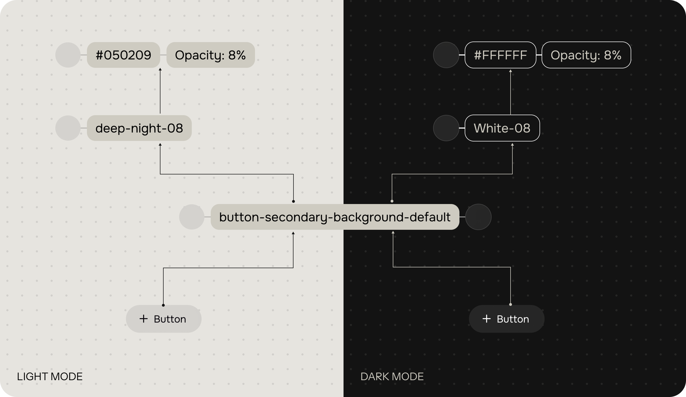
In the past, many of our design decisions lacked context, making it hard to maintain consistency across the product. With this release, we introduced design tokens to bring clarity and structure to our system.
Tokens help us make context-aware decisions—whether it’s color, spacing, or typography—ensuring everything stays aligned with Safe's brand, now and as we scale.

As Safe's platform grew, managing design consistency across a large, evolving product became increasingly challenging.
We realized that a flat or one-dimensional token structure couldn’t support the level of flexibility and clarity we needed—especially when dealing with dark/light themes and component-level overrides.
That’s why we adopted a Three Tier Token System. This model allows us to separate foundational values from context and usage, giving us better control, easier theming, and more scalable collaboration between design and development.


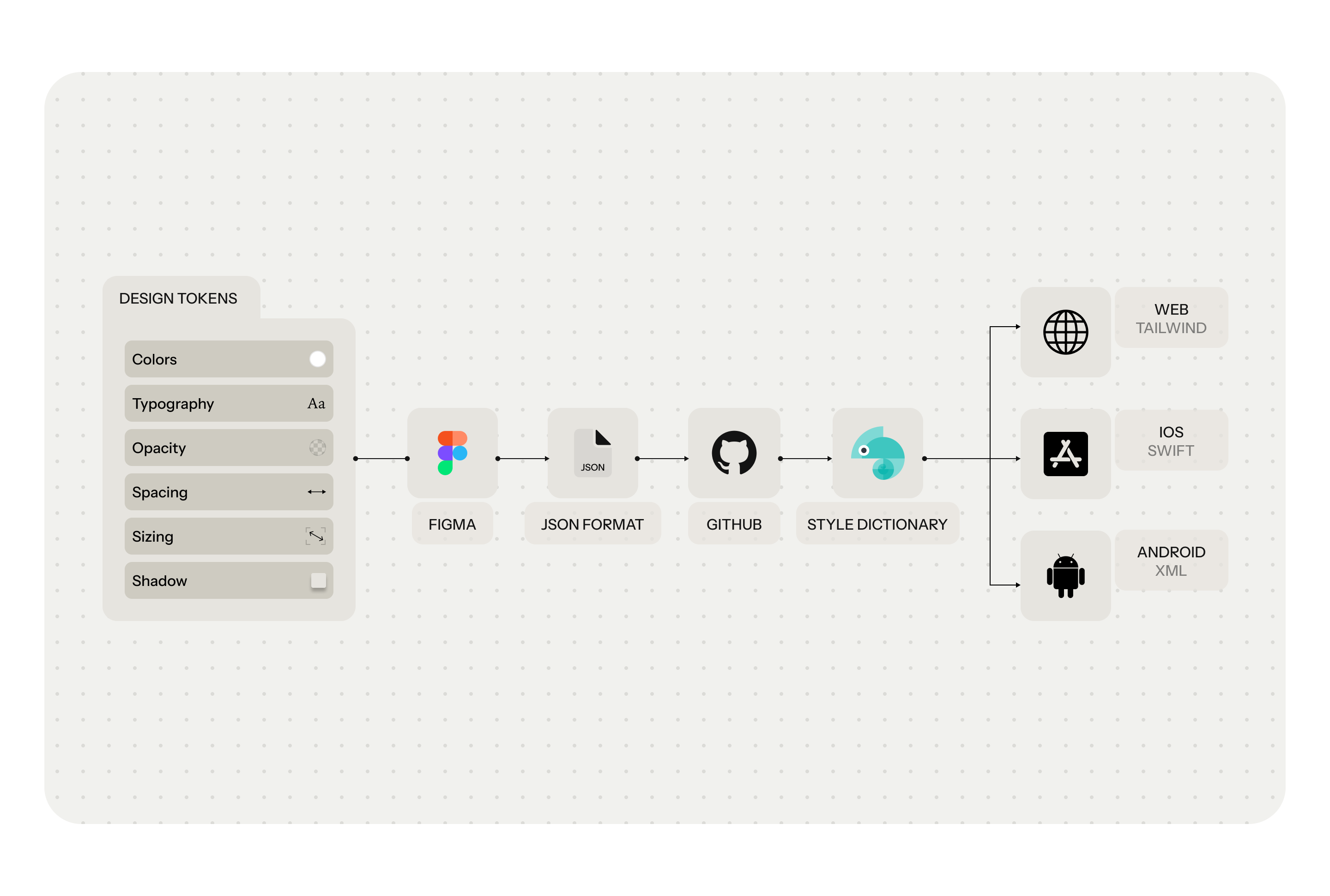
Design tokens—like colors, typography, spacing, and shadows—are first defined in Figma, then exported in JSON format. From there, they’re version-controlled via GitHub and transformed using Style Dictionary into platform-specific outputs
for Web (Tailwind), iOS (Swift), and Android (XML). This pipeline not only keeps design and code in sync but also speeds up implementation while reducing inconsistencies across platforms.

Our Design–Dev Sync Hub is the single source of truth for every component. It covers everything—from what the component is, its variants and states,
how tokens are applied in light and dark modes. It also includes clear usage guidelines and a dedicated space for ongoing discussions, feedback, and collaboration.
The design system became a turning point in how we build and scale. It helped us complete a full product redesign in just 1.5 months,
cut production time by 73%, and boosted design speed by 3.75x. More than visual polish, it brought lasting impact across execution, efficiency, and product consistency.
