Product Design
Turning Overwhelming Cyber insights into Mobile-Ready Intelligence for CISOs
Company
Safe Security
Product Design
Turning Overwhelming Cyber insights into Mobile-Ready Intelligence for CISOs
Company
Safe Security


At SAFE, we’ve built a robust web platform that helps CISOs and security leaders assess and monitor their organization’s cyber risk posture. It delivers powerful insights using rich dashboards, detailed tables, and layered charts—perfect for deep analysis on a large screen.
But we realized a growing gap: most CISOs don’t have the time or environment to explore these insights in detail. They’re often on the move—jumping between meetings, traveling, or managing crises—and they need quick, trustworthy answers at their fingertips.
That’s why we introduced SAFE X—a mobile, Gen AI-powered assistant that lets users ask risk-related questions and get tailored insights instantly, no matter where they are.
But designing this experience came with a unique challenge:
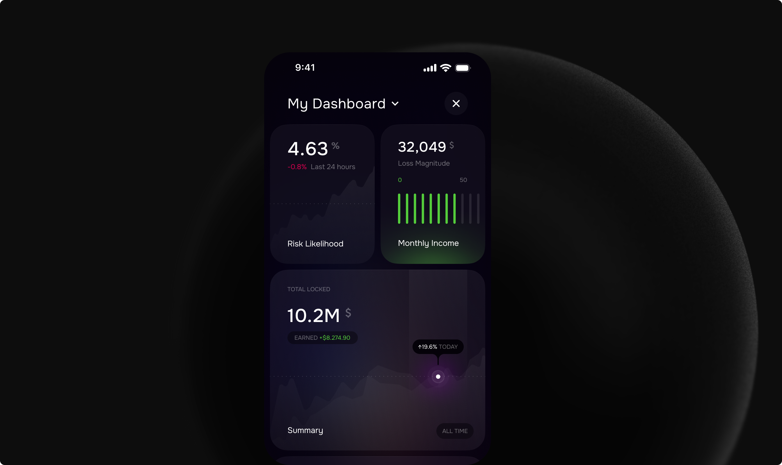
Translating dense, multi-layered cybersecurity data—like risk scores, heatmaps, and benchmark charts—into a mobile format without losing clarity, context, or credibility.
It wasn’t just about fitting content onto a smaller screen. It required rethinking how complex insights are structured and presented—so they feel lightweight, easy to scan, and still trusted by executives on the go.

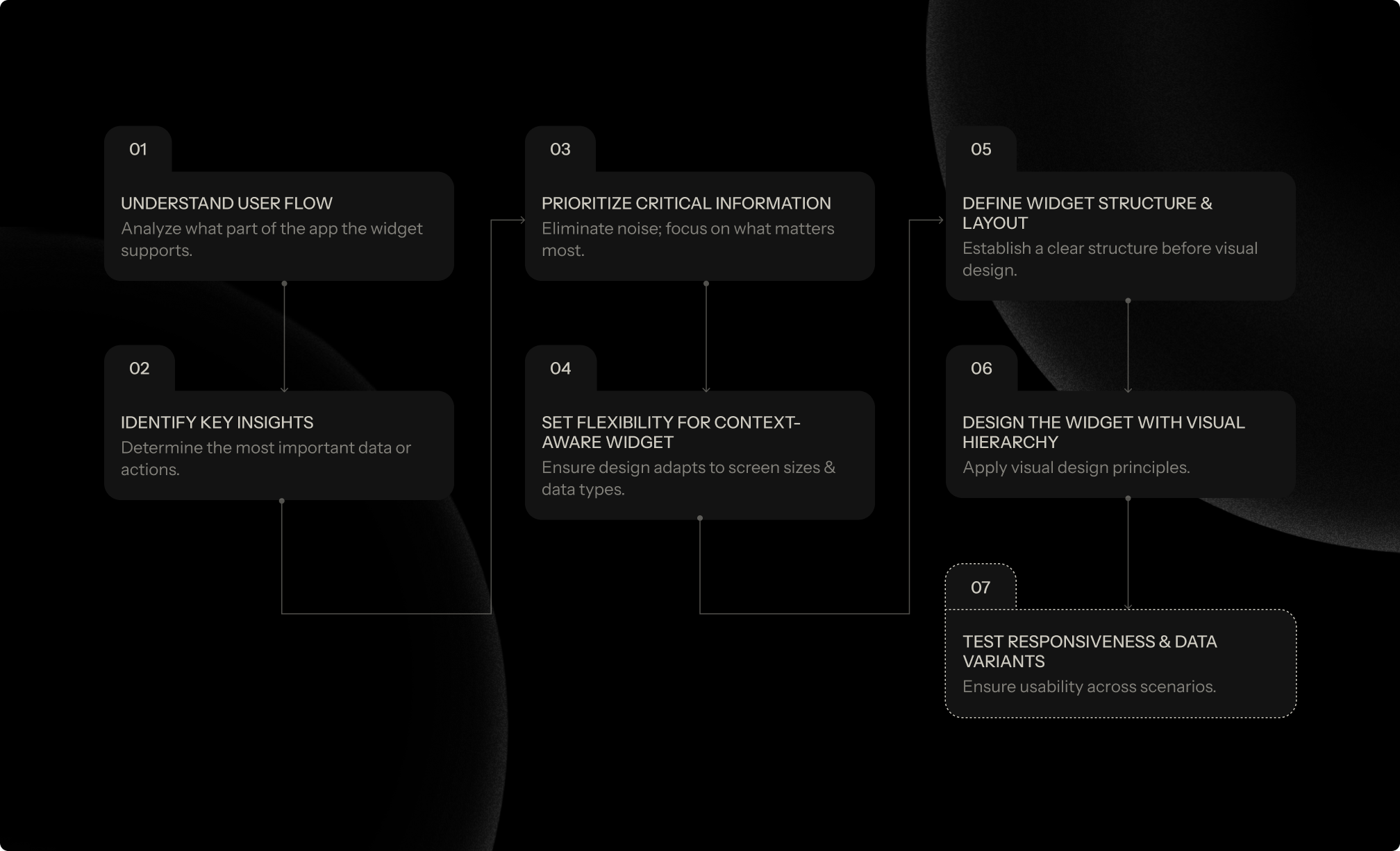
The core challenge was designing a mobile experience that could handle complex cyber risk insights—without overwhelming the user. To address this,
Instead of showing everything, we focused on what matters most—surfacing only the most critical data points for each insight.
Each widget is crafted with a clear hierarchy, meaningful visual cues, and just enough supporting context to help executives grasp the message at a glance.
Priority-first approach: We stripped away noise and highlighted what’s most relevant, making it effortless to understand high-stakes insights quickly.
Scannability by design: From typography to spacing and layout, every element was optimized for quick reading on smaller screens.
Context-aware responsiveness: We tested different data sets and mobile screen sizes to ensure that each widget adapts gracefully
Data-driven patterns, not static templates: Since the app is powered by Gen AI, the structure of the insight varies depending on the question asked.
Our design had to flex accordingly, adapting layout and visuals based on the context and type of data being shown.

